
OneFlow
An internal platform designed for service agents who assist insured individuals and their families with policy queries and appeal processes. The platform consolidates policy data, appeals, and customer interactions into an intuitive, unified dashboard.
Insurance
Enterprise UX
Customer Support

Project Details
My Role:
Duration:
Location:
Platform:
UX Designer
6 Months
Pune, India
Web Portal
Deliverables:
Team:
Stakeholders:
Tools:
-
User Interviews
-
User Journey(s)
-
Wireframes and Prototype
-
User Testing
-
1 UX Designer (Me)
-
1 UX Lead
-
1 BA
-
2 QA
-
4 Developers
-
Project Manager
-
Delivery Manager
-
Service Agent
-
Managers
Design System:
My Responsibilites
Flip to view details
Project Plan/ Scope of Work

As the UX Designer, I coordinated closely with cross-functional teams throughout the project. The responsibilities outlined below were structured in alignment with the project plan, ensuring interdependent tasks were managed effectively and the product was delivered smoothly and efficiently.
UX Designer
-
Research
-
User flows
-
Information Architecture
-
Wireframes and Prototype
-
UI specifications
-
Usability Testing
Business Analyst
-
Requirement gathering
-
Acceptance criteria
-
Regulatory alignment
-
Handover documents
Developers
-
Feasibility input
-
Build the product
-
API integrations
-
Bug fixes
QA
-
UAT
-
Accessibility checks
-
Test scripts
-
UX validation
Product Goals
Provide agents with real-time access to insurance and appeal data
Reduce the number of screens required to complete tasks
Create guided processes for appeals and complex queries
Enable quick search and customer look-up
Ensure data clarity, accuracy, and compliance with internal policies
Business Goals

Reduce average call handling time

Improve operational efficiency with a unified system

Reduce errors and rework caused by inconsistent data sources

Increase customer satisfaction metrics

Reduce training time for new service agents
User Study
Stakeholders Interviewed
Flip to see why they were selected
User Interviews
Certain interview questions and responses have been intentionally omitted to comply with confidentiality and data-protection requirements.

How Their Insights Informed the Design
-
Exposed how fragmented systems increase call-handling time and cognitive load.
-
Highlighted customer frustration caused by delays and inconsistent information.
-
Validated the need for a unified dashboard to centralise all case data and actions.
-
Identified repetitive steps suitable for automation to reduce errors and improve efficiency.

How Their Insights Informed the Design
-
Revealed long onboarding times due to system complexity and scattered information.
-
Highlighted confusion during the appeals process and reliance on colleagues or internal guides.
-
Showed how multitasking between calls and navigation increases stress and error risk.
-
Validated the need for guided workflows, step-by-step prompts, and simplified, centralised interfaces for new users.

How Their Insights Informed the Design
-
Highlighted the impact of fragmented systems on team efficiency, case tracking, and compliance.
-
Showed the need for standardised case-note templates and structured workflows to reduce errors.
-
Emphasised the value of dashboards for live queue monitoring and performance oversight.
-
Validated design priorities for a unified platform that supports both agents and managers in real time.
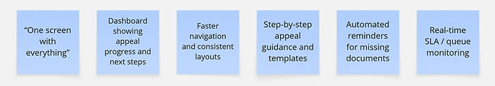
Affinity Mapping
After conducting the user interviews, we synthesised the qualitative insights into an affinity map to uncover patterns, shared frustrations, and cross-stakeholder themes that would guide our design direction
Fragmented System & Mental Model
Multiple disconnected systems make it hard to find information; agents rely on memory and manual cross-checks.

UX Opportunities
-
Build a single consolidated view of all case and customer information
-
Improve information hierarchy & logical grouping
-
Reduce fragmentation with a unified IA
UX Opportunities
-
Quick-reference panels + progressive disclosure
-
Summarised “status highlights” for live calls
-
Reduce click-depth for time-critical tasks
High Cognitive Load & Stress
Agents experience stress during live calls due to multitasking and scattered information

Inefficient, Multi-Step Workflows
Core tasks are slow due to repeated steps and unnecessary navigation.
.jpg)
UX Opportunities
-
Map workflows and remove redundant steps
-
Introduce shortcuts, smart defaults, and guided flows
-
Automate repeatable tasks to reduce handling time
Appeals Process Lacks Clarity
UX Opportunities
-
Step-by-step guided appeal workflows
-
Contextual help, validation, and checklists
-
Dynamic guidance based on appeal type
Submission of appeals is prone to errors; agents rely on colleagues or external documentation.

Steep Learning Curve & High Dependency
New hires struggle to learn the system and depend on senior agents.

UX Opportunities
-
Simplified navigation & consistent component patterns
-
Contextual onboarding, tooltips, empty-state guidance
-
Standardised terminology and flows
UX Opportunities
-
At-a-glance summaries for policy + appeal status
-
Smart search + unified dashboard
-
Customer history timeline for transparency

UX Opportunities
-
Unified command centre/dashboard
-
Streamlined verification + appeal flows
-
Cohesive design system & reusable components
User Journey
Following the affinity mapping and cross-stakeholder synthesis, we translated these insights into rough user journeys. These journeys allowed us to visualise pain points within the current experience and propose ideal future-state flows that directly address users’ behavioural patterns, needs, and workflow gaps.
Scenario 1: When the case is received and resolved by Service Agent himself
Step 1

The service agent (from call center) logs in using his credentials.
Step 4

-
After accepting the call, the service agent can view the relevant member details and documents.
-
He goes through the previous calls and refers to the recommended help tips offered based on the current call type, call reason and product.
Step 2
He lands on the Dashboard where he goes through all the open cases and tasks.
Step 5

-
He simultaneously creates the case and views the auto-populated data based on Interactive Voice Response.
-
He takes the necessary further actions and saves the case.
Step 3

During this time, he receives a call from a member regarding a health insurance query.
Step 6

He answers the member’s query, reviews the case and ends the call.
Scenario 2: When the case is received by Service Agent and further assigned to designated team for resolving
Step 1

Service agent assigns the case to another department for providing the resolution.
Step 3

The service agent views the resolution provided by the department and other case details.
Step 2

-
He can see the status of the cases assigned to different departments on his dashboard.
-
He can also view his pending tasks.
-
He receives the resolution from the department and clicks on the case to see the case details.
Step 4
The service agent calls back the member and closes the case.
Wireframes
Once the user journeys revealed how agents navigated the system and where breakdowns happened, the next step was transforming these insights into wireframes that could be tested and iterated on.

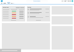
Dashboard
We aimed to design a dashboard that placed essential information and tasks at the centre of the agent’s workflow.
Drawing directly from user interview insights, we explored various layouts to minimise cognitive load and reduce the need for system-hopping.
Through iteration, it became clear that agents required a single, cohesive view rather than fragmented screens guiding us toward a unified, at-a-glance dashboard.
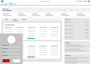
Member Details and Call
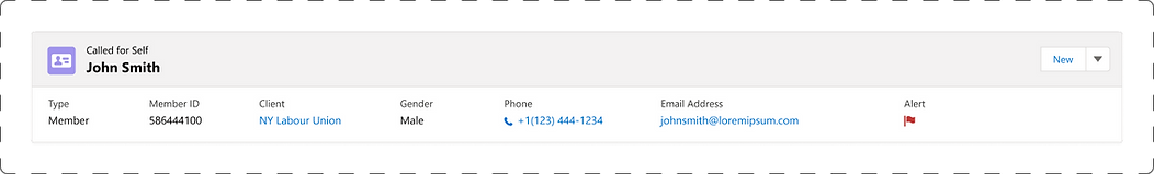
Scenario 1: Members calling for themselves
Once the user journeys revealed how agents navigated the system and where breakdowns happened, the next step was transforming these insights into wireframes that could be tested and iterated on.

-
Auto-Retrieved Context: IVR automatically surfaces the member’s details when the call comes from a registered number, reducing lookup time.
-
Minimised Task Switching: Call controls are placed on the left to keep interaction smooth while referencing member data.
-
High-Pressure Usability: Large, high-contrast controls support fast, error-free actions (Hold, Mute, Transfer).
-
Context at a Glance: Inquiry number, call reason, and timer stay persistently visible for continuity.
-
Safe Interactions: “End Call” is isolated at the bottom to prevent accidental tap during multitasking.
-
UI Consistency: Fully aligned with Salesforce Lightning guidelines to minimise cognitive load and training time.
-
Prioritised Information: Eligibility, employment data, and recent interactions surfaced prominently based on agent workflow needs.
-
Reduced Cognitve Load: Clean hierarchy and SLDS-aligned tabs support fast scanning during live calls.
-
Consistency & Compliance: Fully adheres to Salesforce Lightning guidelines for predictable interactions and technical feasibility.
-
Task Efficiency: “View All” and structured tables enable quick validation of coverage, dates, and status.
-
Context Preservation: Key member information and alerts remain fixed at the top to avoid scrolling during calls.

Scenario 2: Insurance Providers calling for members
Flexible Search: Agents can manually search for a member when callers are phoning on behalf of someone else.

The interface surfaces Called by and Called for information at the top of the page to ensure immediate visibility of the caller type, enabling agents to comply with data-access restrictions and provider-specific disclosure rules.

Case Creation Flow

Step 1
Agents can initiate a new case directly from the live call, reducing context switching and allowing case creation to happen at the moment of need or later through the Create Case action.
Step 2
A guided pop-up with pre-populated fields streamlines data entry, minimises manual errors, and removes the need to navigate through multiple pages, which directly addresses the workflow friction identified in interviews.


Step 3
Once created, the case appears pinned at the top of the member’s record, enabling agents to quickly review progress and provide accurate, real-time updates without relying on other teams, significantly improving call efficiency and reducing handle time.
Design System
We developed a custom component library within the Salesforce Lightning Design System (SLDS) to bridge the gap between design and development.
This library:
-
Ensured UI consistency and coherence across all screens and flows
-
Provided clear, implementation-ready standards aligned with SLDS patterns
-
Reduced redundancy by enabling reusable, modular components
-
Helped both designers and developers work efficiently with a shared visual and technical source of truth
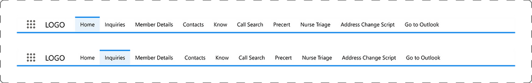
Navigation Bar
Page Header: Member's Details
Status Bar

Card Layouts
Card Layouts

Badges
Search
Pop-up


Form
Claim Status
Approval Status
Priority
List Views
Usability Testing
With the refined wireframes in place, we moved into usability testing to validate whether our design decisions genuinely supported agents’ real workflows and reduced the pain points uncovered in earlier research

-
Collected cross-functional feedback from BAs, QAs and Developers to align design decisions with system logic and technical constraints.
-
This ensured our design decisions were aligned across all stakeholders.
-
Conducted Usability Test to validate real-world task flows and identify immediate usability gaps.
-
This helped us understand practical breakdowns that only surface during real tasks.
Usability Testing with the UAT
Cross-Functional Feedback Collection
-
Refined key screens and interactions based on insights, ensuring improved clarity, reduced cognitive load, and SLDS compliance.
Targeted Redesign Based on Insights
-
Ran usability tests on the updated prototype to confirm task success, reduced effort, and overall flow improvements before handoff.
-
This round confirmed clarity of flows, reduced task time, and improved learnability before moving toward final development.
Prototype-Based Usability Testing
User Insights
The new experience not only addressed core usability issues but also created measurable business value, improving efficiency, consistency, and customer trust.
Business Goal Alignment
Enhance Agent Efficiency
1
-
Streamlined workflows with fewer steps
-
Faster onboarding using a reusable SLDS component library
Improve Service Quality
2
-
Structured note templates and guided flows
-
Customised content based on user persona (member, provider, agent, manager)
Strengthen Trust & Compliance
3
-
Built-in data security and privacy considerations
-
Clear role-based access to sensitive information
Scale Operations Effectively
4
-
Reusable, developer-friendly components
-
Flexible system architecture for future workflow expansion
Increase Customer Satisfaction
5
-
Faster resolution with real-time case visibility
-
More accurate and consistent communication